Editor's Note: This article is adapted from a blog post at Resolve to Save Lives that summarizes a series of tweets sent by the author at the end of last week as part of a regular weekly round-up on the state of the COVID-19 pandemic, with a focus on the United States. Last week's tweets explored some of the latest epidemiological data and called for focusing on data that matter the most—highlighting the fact that we will save the most lives in the COVID-19 pandemic if we drive progress through data, science, and open communication.
□ □ □ □ □
What a week. There’s broader recognition of how serious the U.S. failure is, but not enough on what needs to get done. The virus has the upper hand, it won’t stop until we stop it, and we won’t stop it until we focus better on the most important data. It’s misleading to focus on case counts. The United States is reporting 4.2 million detected cases, but there are probably more than twenty-five million Americans infected already, although we don’t know the number for sure.
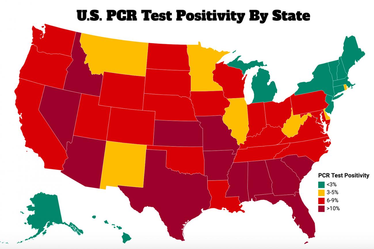
Test positivity rates are more instructive, and are deeply concerning. Other than the Northeast and a few other places, the country is awash in virus. It’s encouraging that the increase is beginning to crest in some areas, but we can’t afford to level off at a high level of transmission.
We seem to be reverting to THESE not THE United States—the intensity of spread differs enormously depending on which state you’re looking at. Overall, test positivity rates declined in the last week, but increased in many states. Clinical, mostly hospital, and commercial lab positivity rates declined while public health lab positivity rates went up.
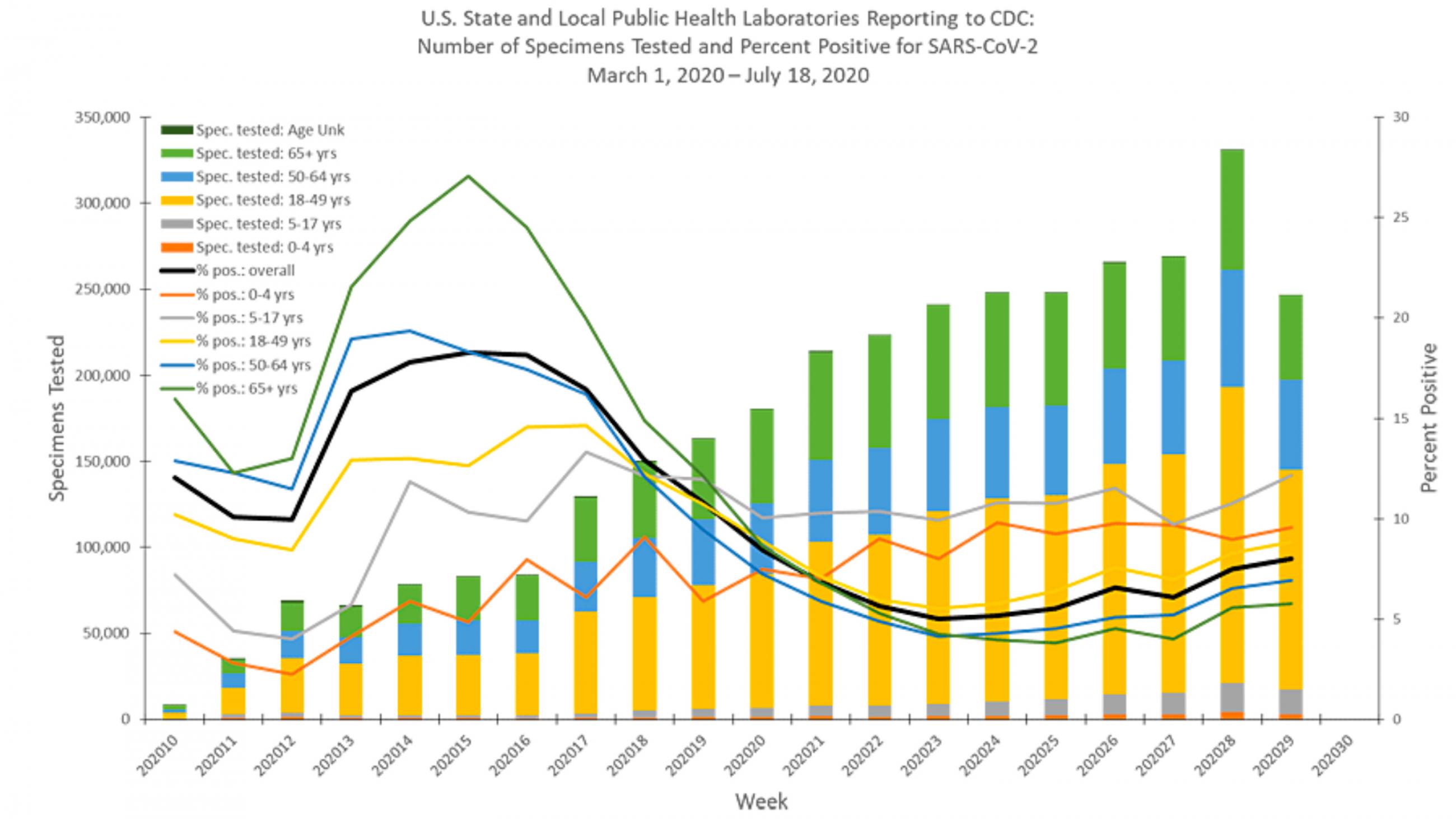
Lab data are complicated. Here’s the data from public health labs. The gray line shows a rapid increase in test positivity among five- to seventeen-year-olds but an encouragingly blunted increase in people over sixty-five, with less blunting in younger adults. That is, cases among people over sixty-five aren’t increasing as rapidly as they increased in the previous week. Clinical labs, which don’t provide data by age group, showed a decrease.
Many test results have been very delayed, which means they are of little value
The number of tests done by commercial labs peaked at 2.5 million tests per week during the week of June 22-28. The latest numbers are more than half the peak total and many results have been very delayed, which means they are of little value. Commercial labs charge for testing, but the public doesn’t benefit. Think about it. At $100 per test, and some are much more, that’s approximately $1 billion dollar a month for tests of very little value. In any case, we’re seeing generally encouraging decreases in positivity with decreases in all age groups.
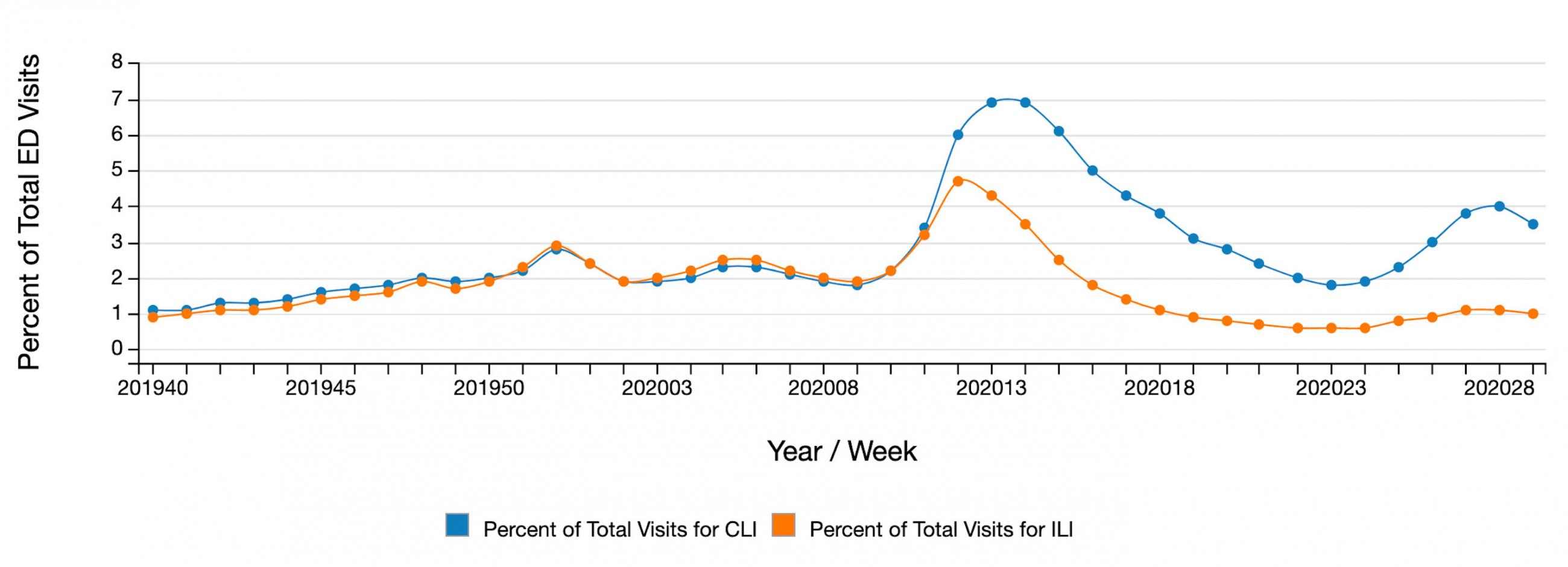
Data from emergency departments on influenza- and COVID-like illness (ILI and CLI) suggest that infection rates may be stabilizing or decreasing in many areas. This wave overall appears to have crested, but the situation is different in different parts of the country.
Publishing infection rates by race and ethnicity each week is important to target interventions. Check out these great examples from Travis County, TX and King County, WA. There’s no reason every state and county can’t report this information so that we can better understand and address racial/ethnic disparities.
Bad news throughout the South: >10 percent is high
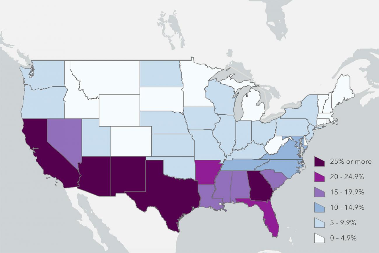
HHS Protect, a platform from the U.S. Department of Health and Human Services (HHS) for securely sharing data on COVID-19, is now providing public information on hospitalizations. With mandated reporting as a condition to get the drug Remdesivir (which HHS could have done when data was flowing to CDC, the Centers for Disease Control and Prevention), hospitals are increasingly reporting this information. Daily hospitalizations per capita is one indicator from Resolve to Save Lives’ list of fifteen essentials. Bad news throughout the South: greater than 10 percent of hospitalizations per capita is high.
The percent of deaths attributed to pneumonia, influenza, or COVID-19 increased from June 27–July 11 for the first time since mid-April. The percentage for last week is 9.1 percent, lower than the percentage during the previous week (11.5 percent), but deaths remain above the epidemic threshold.
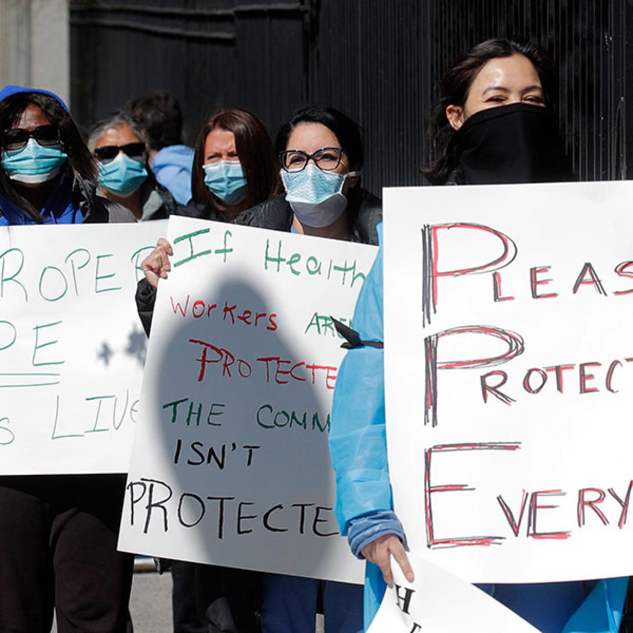
It’s great to see progress on masking up, but that’s not enough. No single intervention—not even a vaccine—will make COVID-19 go away. We need a comprehensive, data-driven response.
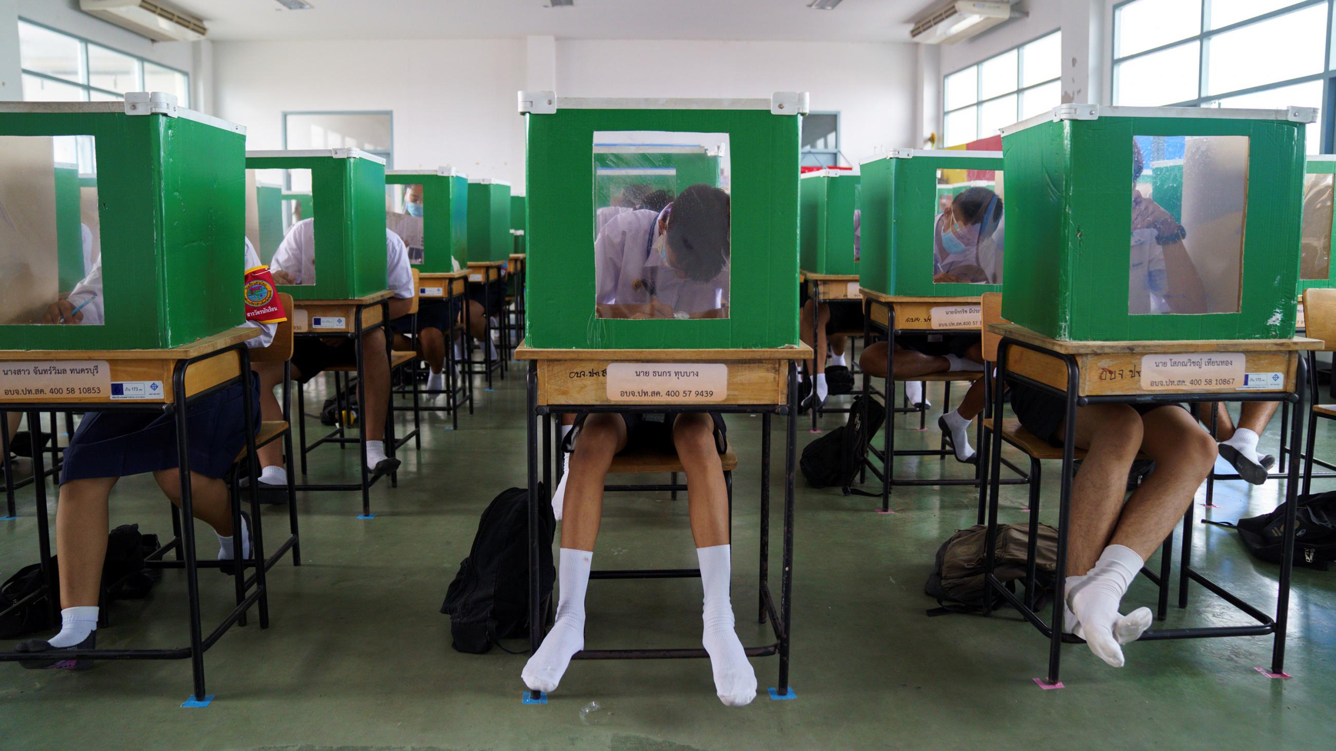
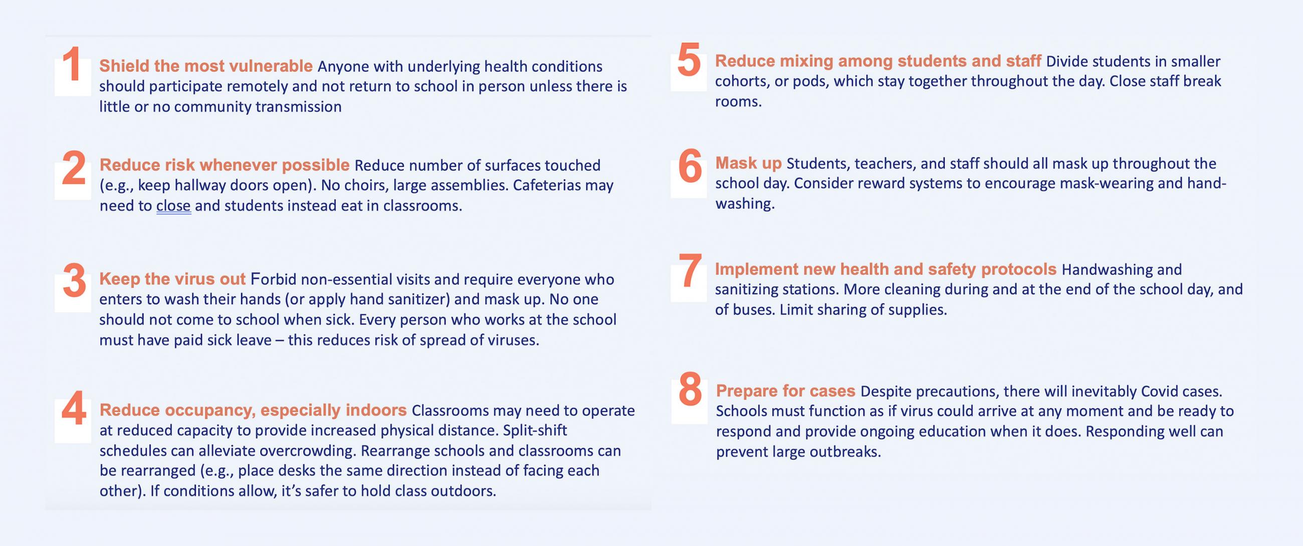
Schools are top-of-mind for millions of students, parents, teachers, and staff. The risk to staff and vulnerable household members, including the risk posed by older kids, needs to be considered. Any community can open schools. Keeping them open is the hard part and only a community that controls COVID-19 and opens schools carefully will be able to keep them open. The reality is that we need to try carefully and learn as we go. Our children’s future depends on it.
Is it raining coronavirus around me?
COVID Exit Strategy built out a great new map showing each state’s progress on reporting Resolve to Save Lives’ essential indicators. We need a clear view of the pollen-count equivalent for every county. Is it raining coronavirus around me? How well is my community doing protecting people from it?
Everyone should be able to get the answers to these questions.
I’ve done more than a thousand interviews and written more than fifty articles and reports since January, and this one may be the most important. We need to get on the same page about essential indicators of risk and response. Without transparency and accountability, we won’t see progress.
We control what the virus does, and if we don’t act, the virus will control us
Global death rates march onward, sadly, and Latin America is getting hit hard. Remember, this is a new coronavirus. There’s a lot we still don’t know about it. I don’t trust estimates more than three- to four-weeks out, but we may indeed see a crest in deaths in a few weeks, then a decline. But don’t count on it. All of this depends on us. We control what the virus does, and if we don’t act, the virus will control us. We’ll only reopen and keep schools open if we unite to fight the virus while keeping physically distant. We’ll only regain economic momentum if we stop the virus’s momentum. We’ll save the most lives if we drive progress through data, science, and open communication.